
Discovering the Joy of 2020
/ Website Concept
My plan was to create a website which archives the moments we found during the Covid 19 Pandemic. Representing a collective memory. Highlighting the idea that in the future that even through tough times there are always small moments which they can appreciate.
///
The Content
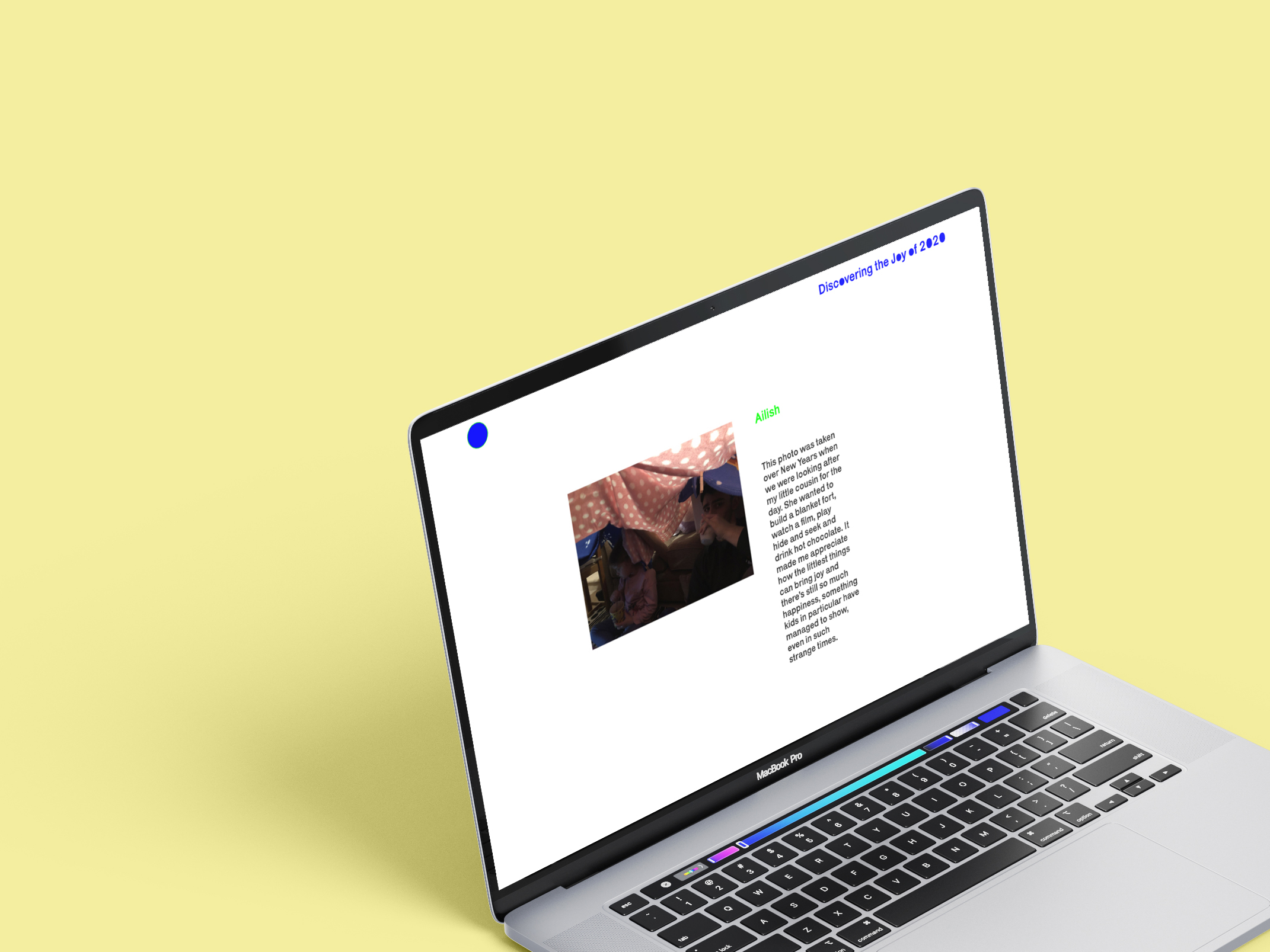
I asked a wide range of people for a picture and a description of why this moment gave them joy.
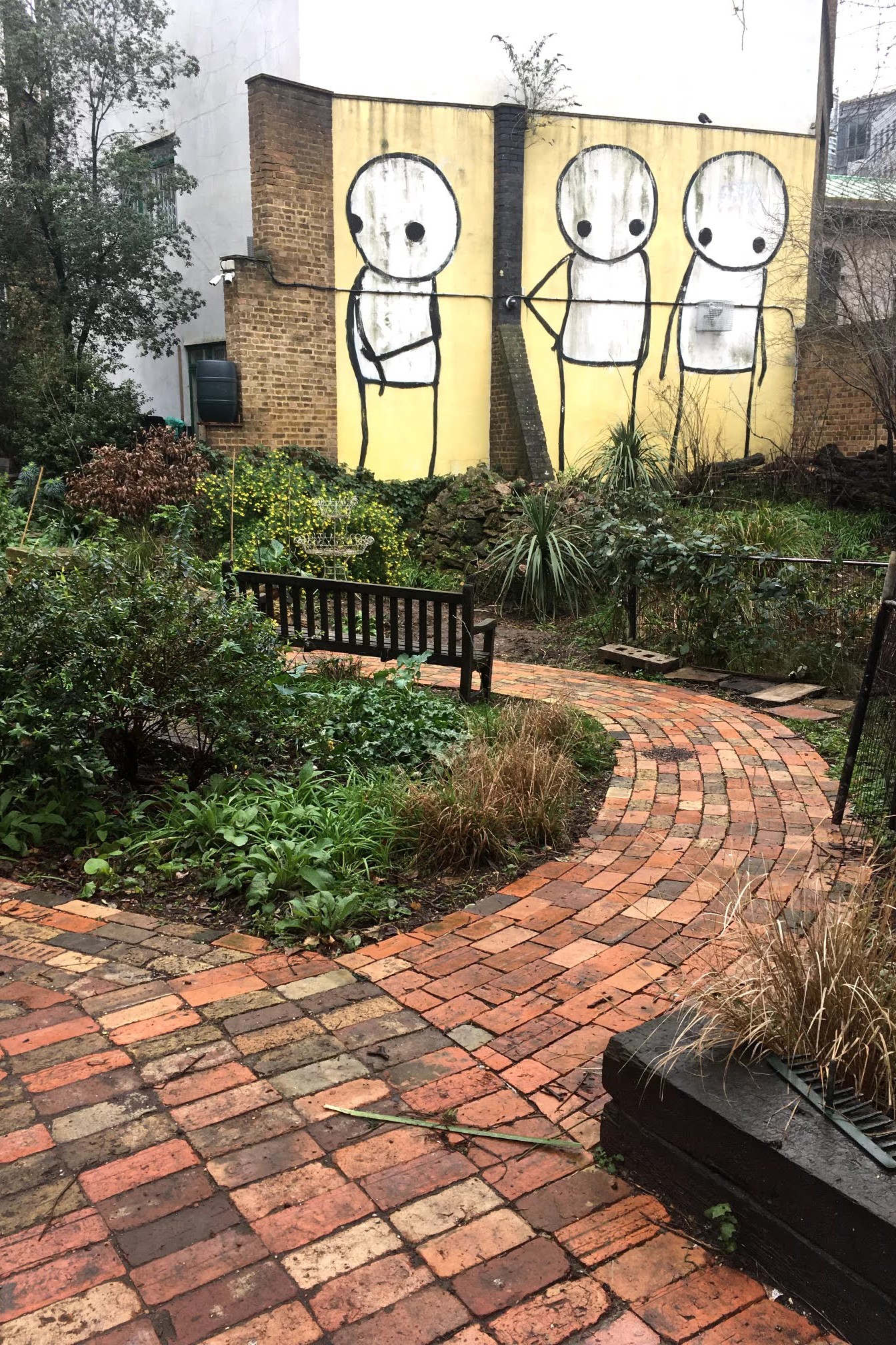

For me the best thing about
lockdown that has kept me
going has been getting to
explore the area around me.
I’ve been able to visit places I
never would have thought of
going before and discovered
so many hidden gems. This
photo is of Phoenix Garden
near Covent Garden - a quiet
spot full of wild flowers and
birds right in the middle of
central London.
///
The Development
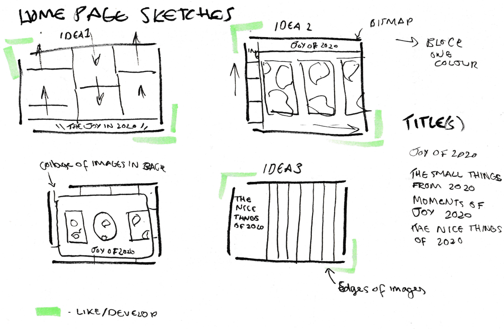
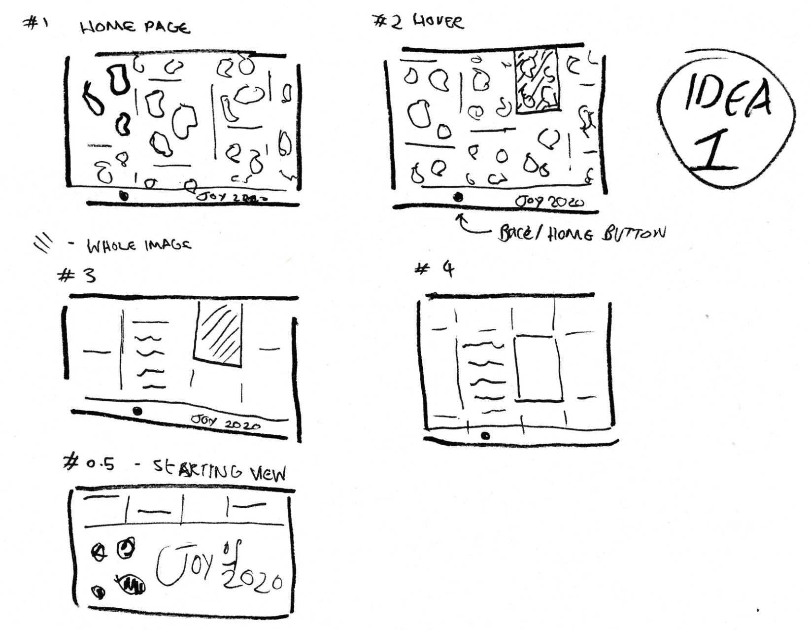
I created many sketches and prototypes on XD to create this archive, helping me to establish my design for the website and my concept for the website.
///
The Concept
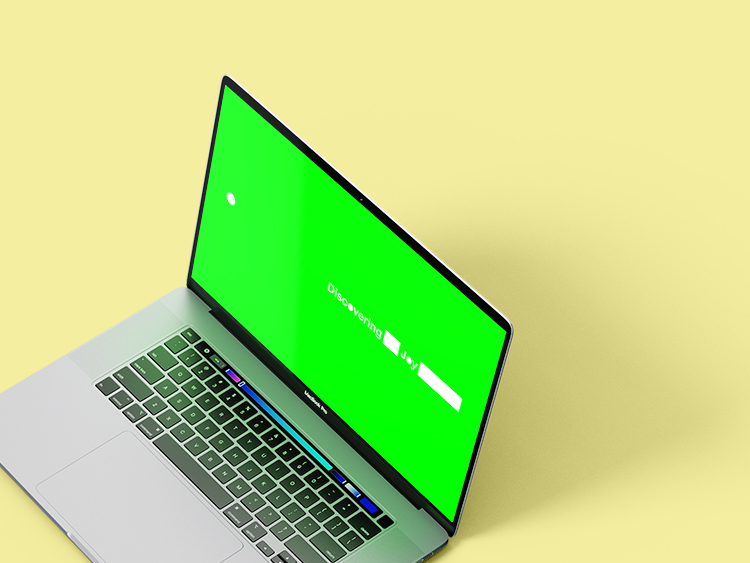
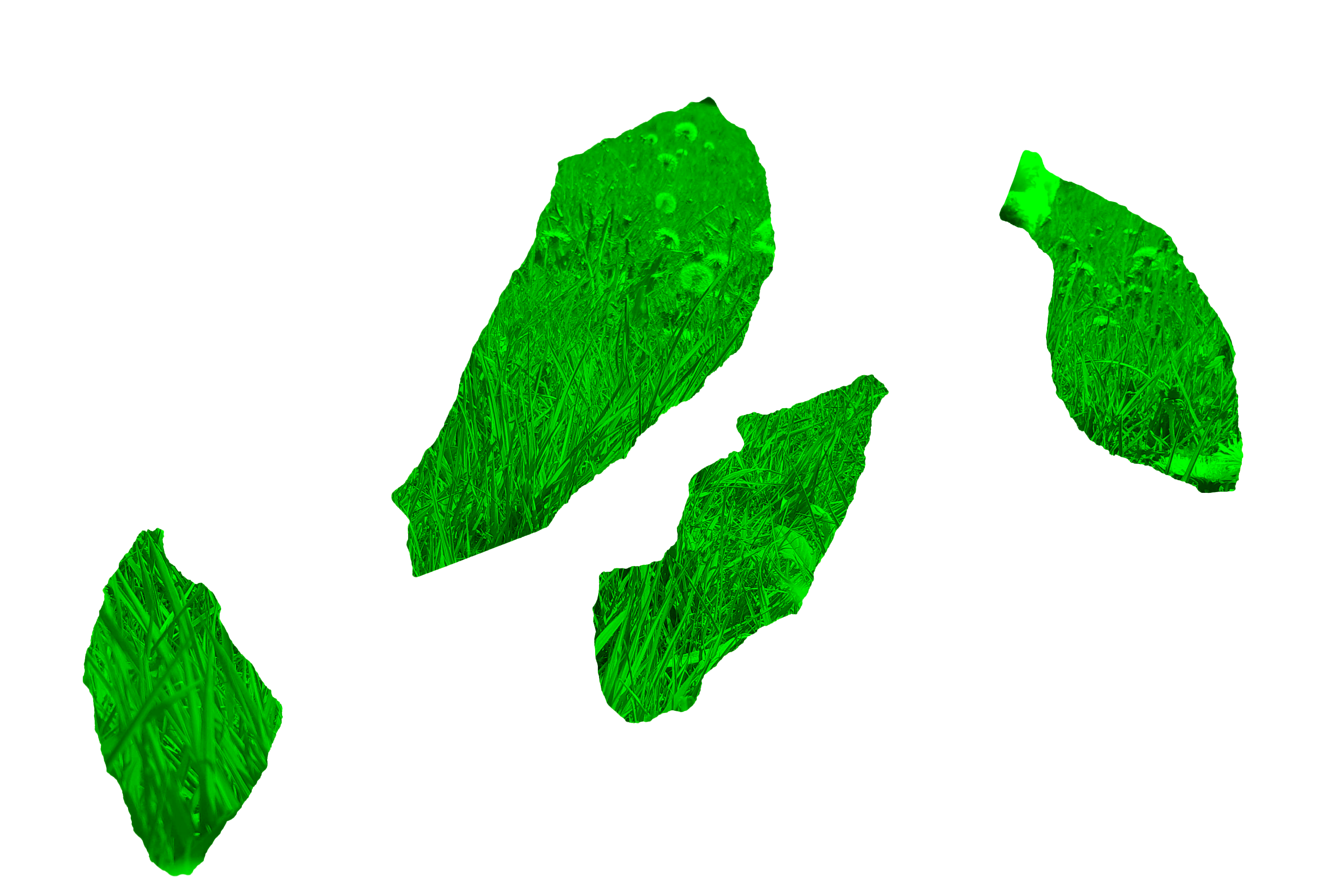
/ A collective memory I wanted the narrative of the website to be ‘discovering a memory’.
Each image when first seen will be a fragment
of a memory. To do this I scanned ripped pieces
of paper and made the image the shape of the
paper.


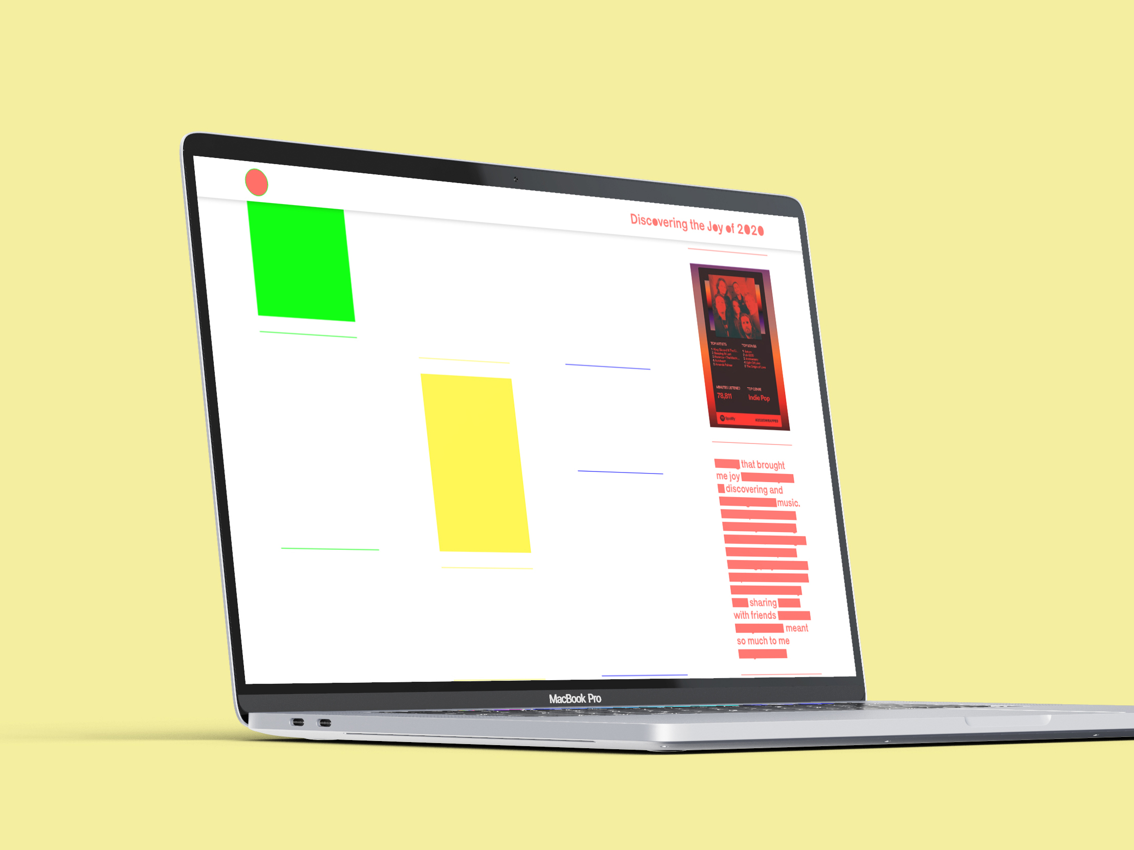
/ Text
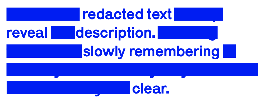
I also used redacted text to help
reveal the description. Creating this idea of slowly remembering a
memory where initially only small bits
of the memory are clear.

I chose one sans serif font (Karrik) for the title and
body copy, because it was simple therefore
not over powering the imagery. Each letter
is also not totally the same mirroring the
multiple different responses people had given.
To create unity with the shapes that are used throughout. I made the title’s ‘0’ and ‘o’ the same conveying the idea of this forgotten memory.
To create unity with the shapes that are used throughout. I made the title’s ‘0’ and ‘o’ the same conveying the idea of this forgotten memory.
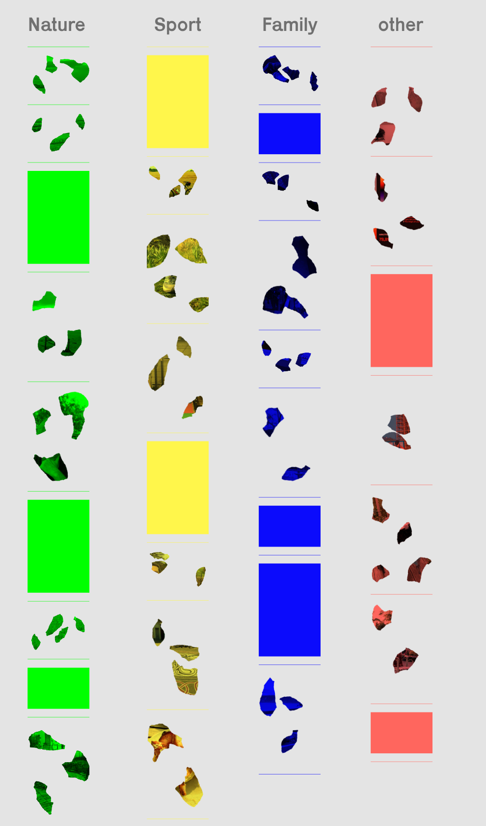
I created categories of
the imagery/description
I had collected and
divided them by colour.
I made each colour neon, which evokes the sense of joy and happiness. I also chose primary colours because they have connotations of childhood where joy was more easy to find.
The coloured squares is a representation of patchy memory, it is showing the bits of memory which are not there.
I made each colour neon, which evokes the sense of joy and happiness. I also chose primary colours because they have connotations of childhood where joy was more easy to find.
The coloured squares is a representation of patchy memory, it is showing the bits of memory which are not there.
///