


Klein Blue
/ ISTD Competition Entry Book Design
This is my response to ISTD’s Student Assessment Brief ‘A Colourful Story’. I chose to create a book about the perception of Klein Blue (IKB), infamously created by the abstract artist Yves Klein.
///
The Aim
My aim is to create a booklet/poster describing the interesting story of how Yves Klein came to creating Klein Blue. This booklet/poster will also question whether what Klein believed about the colour is actually true. Helping to push the reader to examine Klein Blue and come to their own conclusions about the colour, and to remove any prejudices they might have had about this colour.
///
The Audience
The target audience for this book is Art Students aged 18-25 who may have/want to learn more about Klein for a project. Mainly because I found the research behind Yves and his Blue either to brief or too dense my aim is to reach the middle with this book so the student can come to their own conclusion.
///
The Concept
The concept of this booklet was to make it a monochrome and minimal as possible. Evoking Klein Blue. I also want the reader to get ‘lost into the blue’ which was what Klein wanted for his colour. I will do this by looking at paper size and keeping to the monochrome scheme.
///
The Design
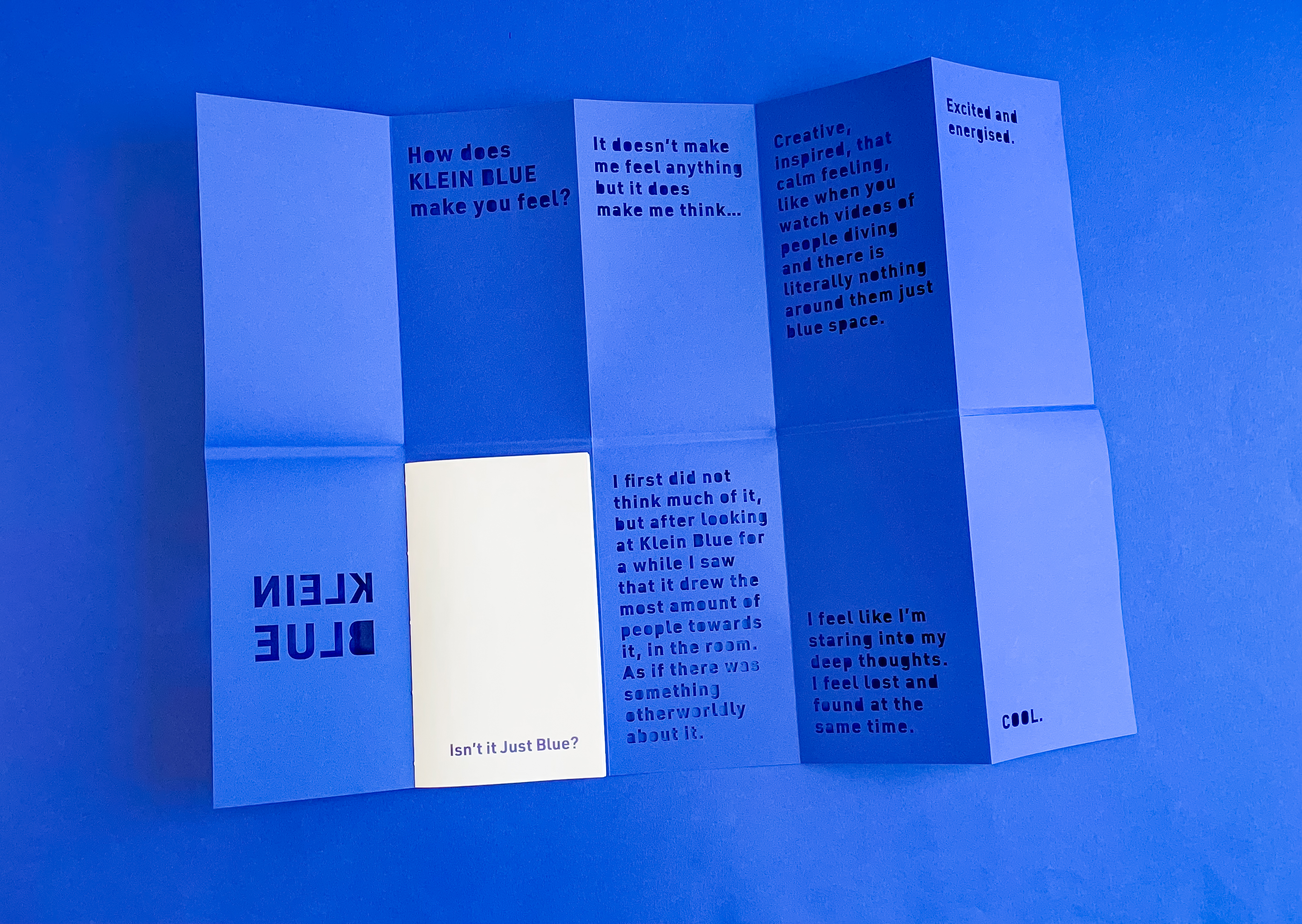
/ Poster
![]()

In the poster section I will have answers to
a survey a conducted amongst the target audience, to show their opinions on the colour. Each answer has been lasercut to make the poster as monochrome as possible.
Klein made each of his exhibitions showing Klein blue, very performative and made people talk about it for days afterwards. He used performance art to help explain his colours. That is why I did not make this format a simple book, the reader has to think and move to open it up.
/ Booklet
In the booklet stitched into the poster this will have research backing up why Klein created this colour. And then explain what he thought the colour could do to a viewer.
These two things combined will make the reader create their own opinion about the colour.
/ Typography

I was inspired by old poster designs for some Klein’s Exhibitions and based my choices from that. Every poster evoked a feeling of modernity and minimalism helping to represent the colour. As well as appeal to the young modern audience.
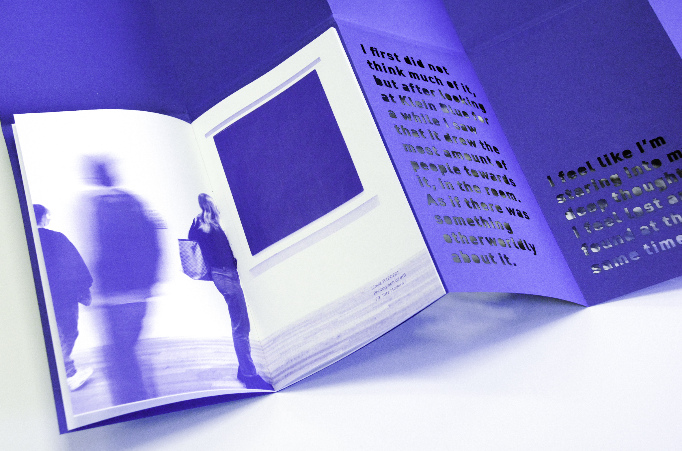
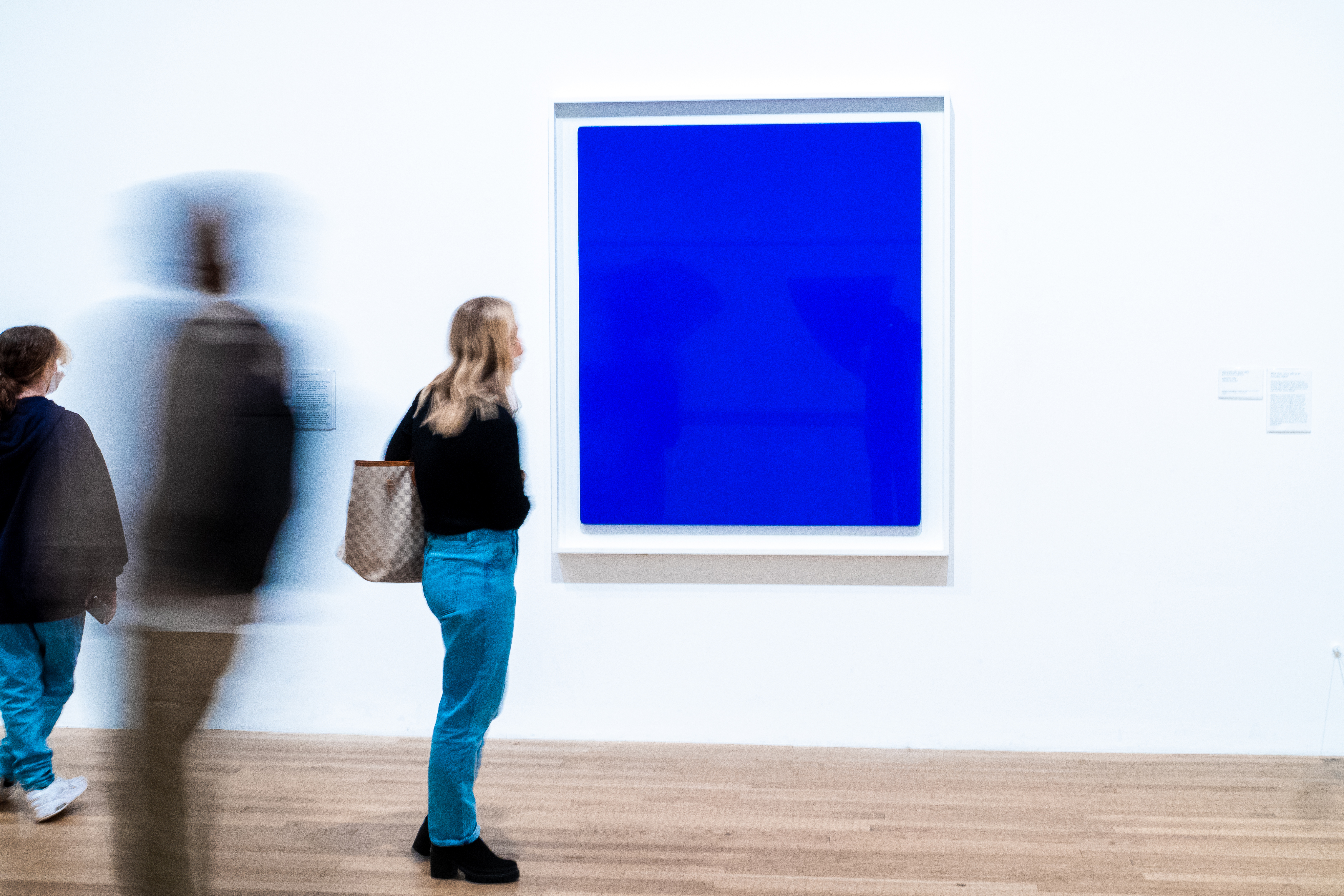
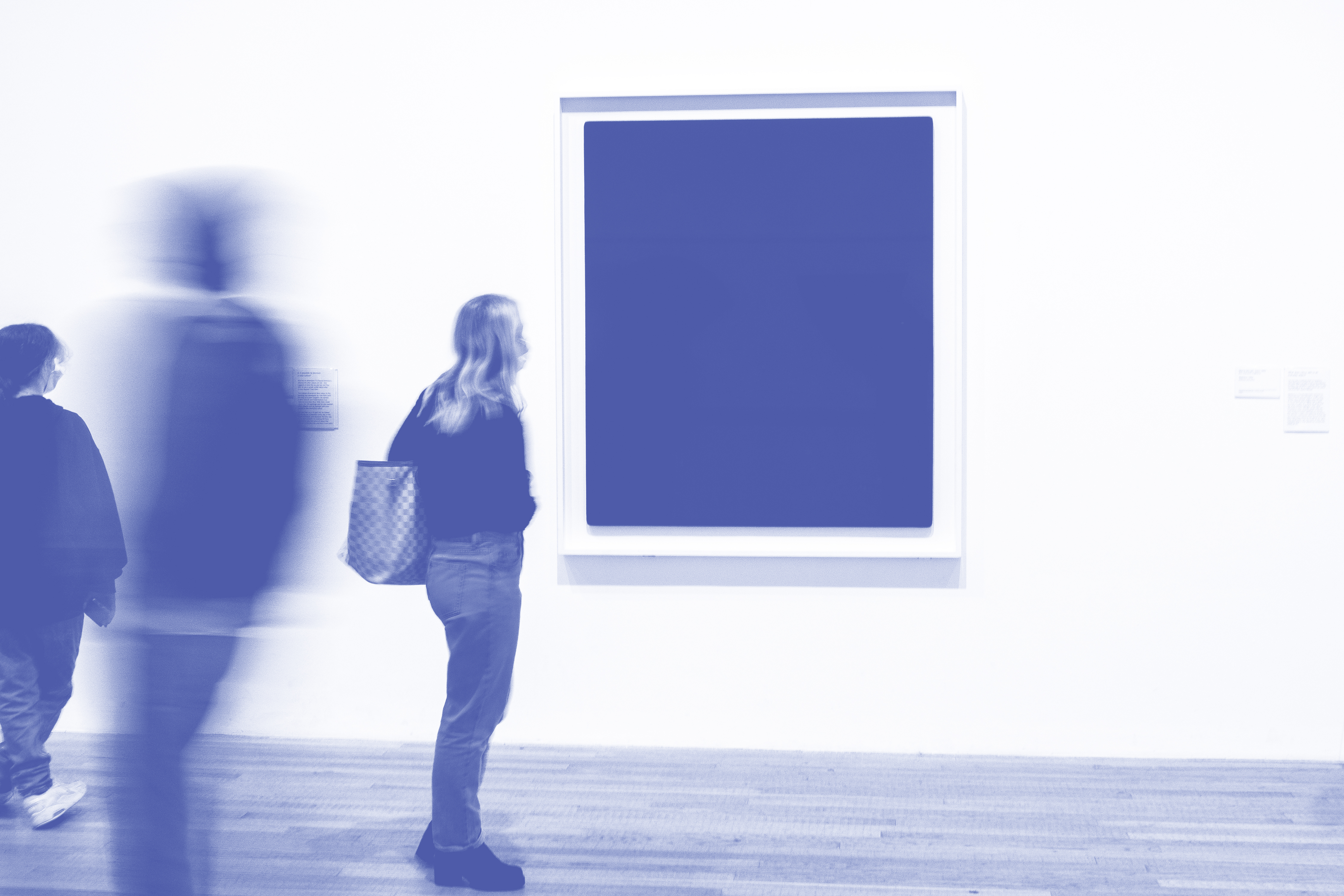
/ Imagery
![]()
I turned my imagery into duotone so that the main colour was Klein Blue. Helping to convey to the audience that this is all about Yves International Klein Blue not any of his other work.
I turned my imagery into duotone so that the main colour was Klein Blue. Helping to convey to the audience that this is all about Yves International Klein Blue not any of his other work.
///