


LetterBox
/ Shortlisted Cultural Awareness Project
This is a shortlisted project I created alonglside Rossilyn Baker for the Creative Conscience Award 2021. We decided to address and help battle, loneliness amongst the elderly population. This problem has risen due to COVID 19. Our solution was to create a pack called LetterBox: Digital Communication Guide. This will provide information on how to contact their friends and family through digital communication.
“28% of over-70s ‘not confident’ in using digital
technology – but over half 51% are having to use it
more or much more since the crisis.”
/ COVID 19 Loneliness Survey, Elder
///
The Pack
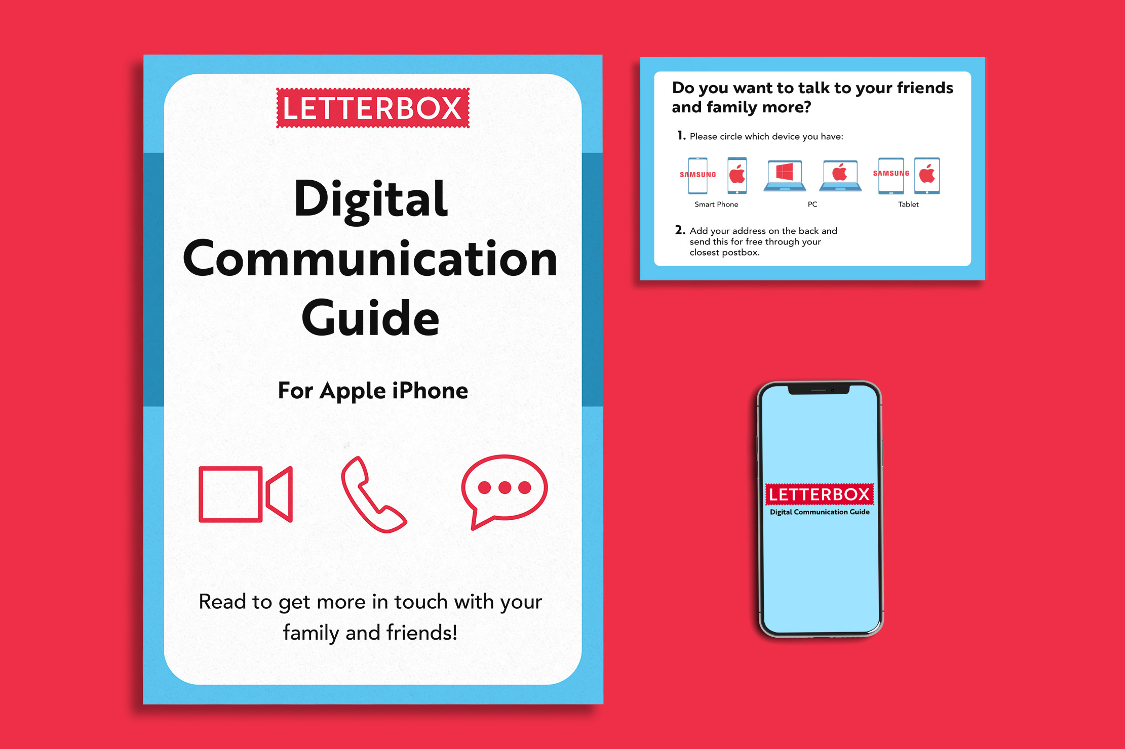
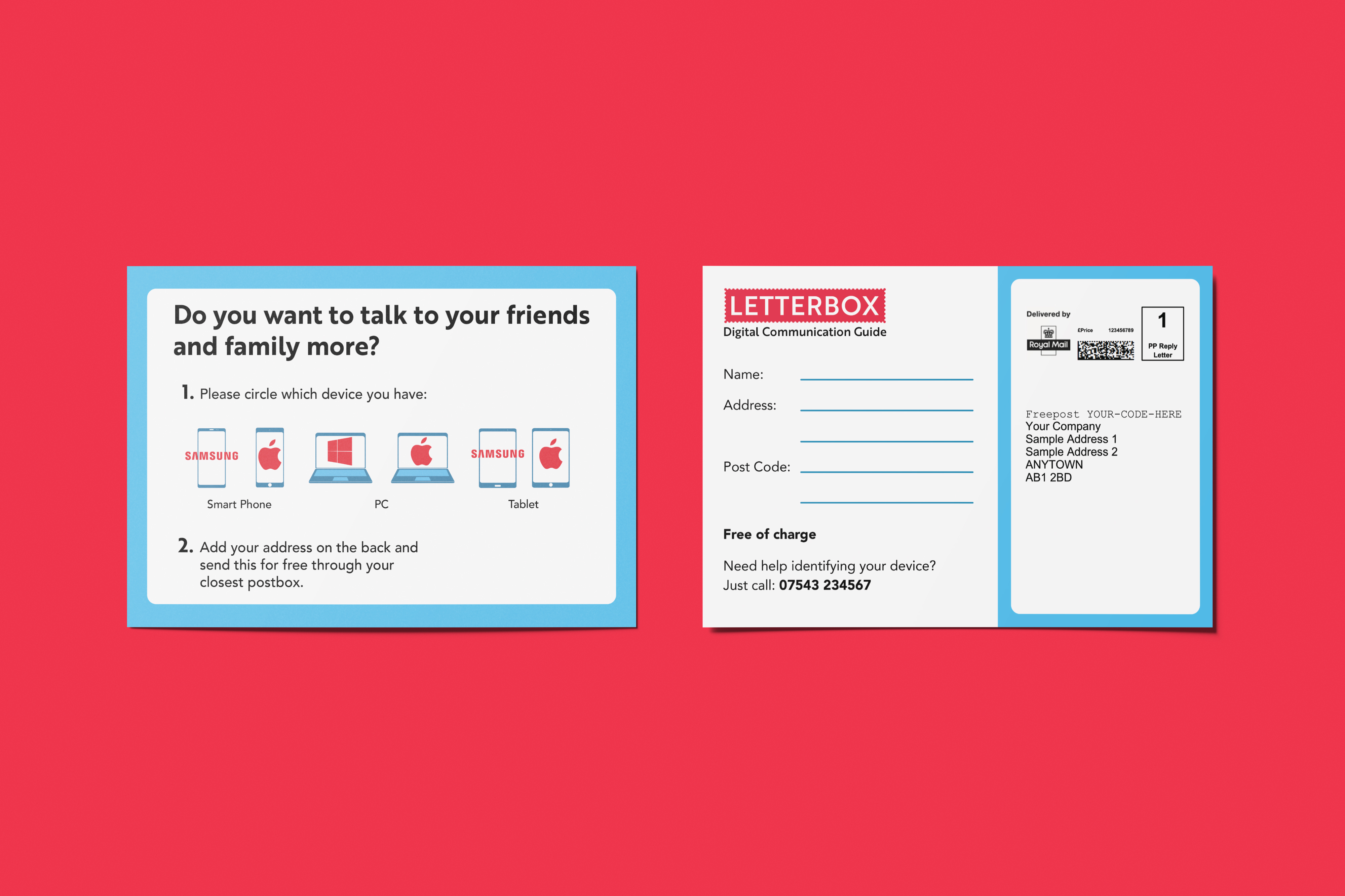
This pack consists of a three step process:
-
A postcard will come through the door. The elderly will be able to signify whether he/she/they want help and specify for which device is needed. The postcard can be sent back to LetterBox through free post.
-
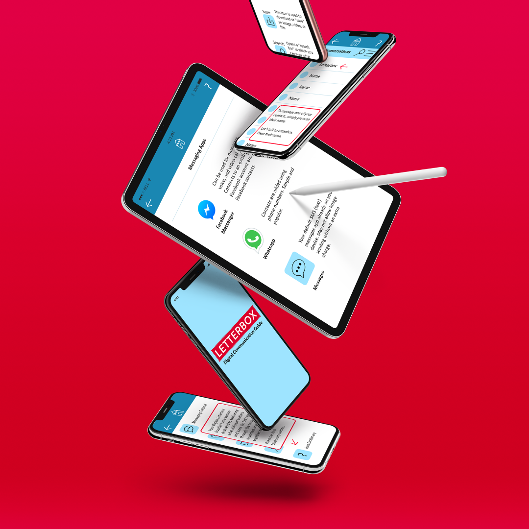
A booklet giving a step-by-step guide on how to use various apps and an Icon dictionary to help navigate those apps will come through the door. The book will have a section that will help the reader to download a ‘practice app’.
-
A practice messaging and icon App will guide users on their device. Users will learn, for example, how to contact people and write and receive text messages.
///
Target Audience
Males and females over 70s in the UK, lacking technological literacy and living alone or with an elder partner.
///
Design
To make this pack as accessible as possible for our audience we had to research the best UI and Print design methods for the elderly. We had to reconsider every element.
/ Colour


We chose these colours because they are bright and contrasting, but at the same time they do not have an undermining or stressful tone. Indeed, we chose blue because it creates a calming effect, and red but with pinky/orange tones to avoid conveying a sense of danger.
/ Typography

We chose to use sans serif for both our title and body font. In order to make the font as clear as possible. In print we did not go below 12pt and on average used 14pt as the body copy once again to make it as clear as possible.
We used Brother 1816 in Bold for titles and headers. As we thought it was seen as friendy and not over powering. Making the reader calm.
We used Avenir for body copy in print and Calibri for body copy in digital. Both simply spaced fonts, once again making it easy to view.
We used Brother 1816 in Bold for titles and headers. As we thought it was seen as friendy and not over powering. Making the reader calm.
We used Avenir for body copy in print and Calibri for body copy in digital. Both simply spaced fonts, once again making it easy to view.
/ Imagery
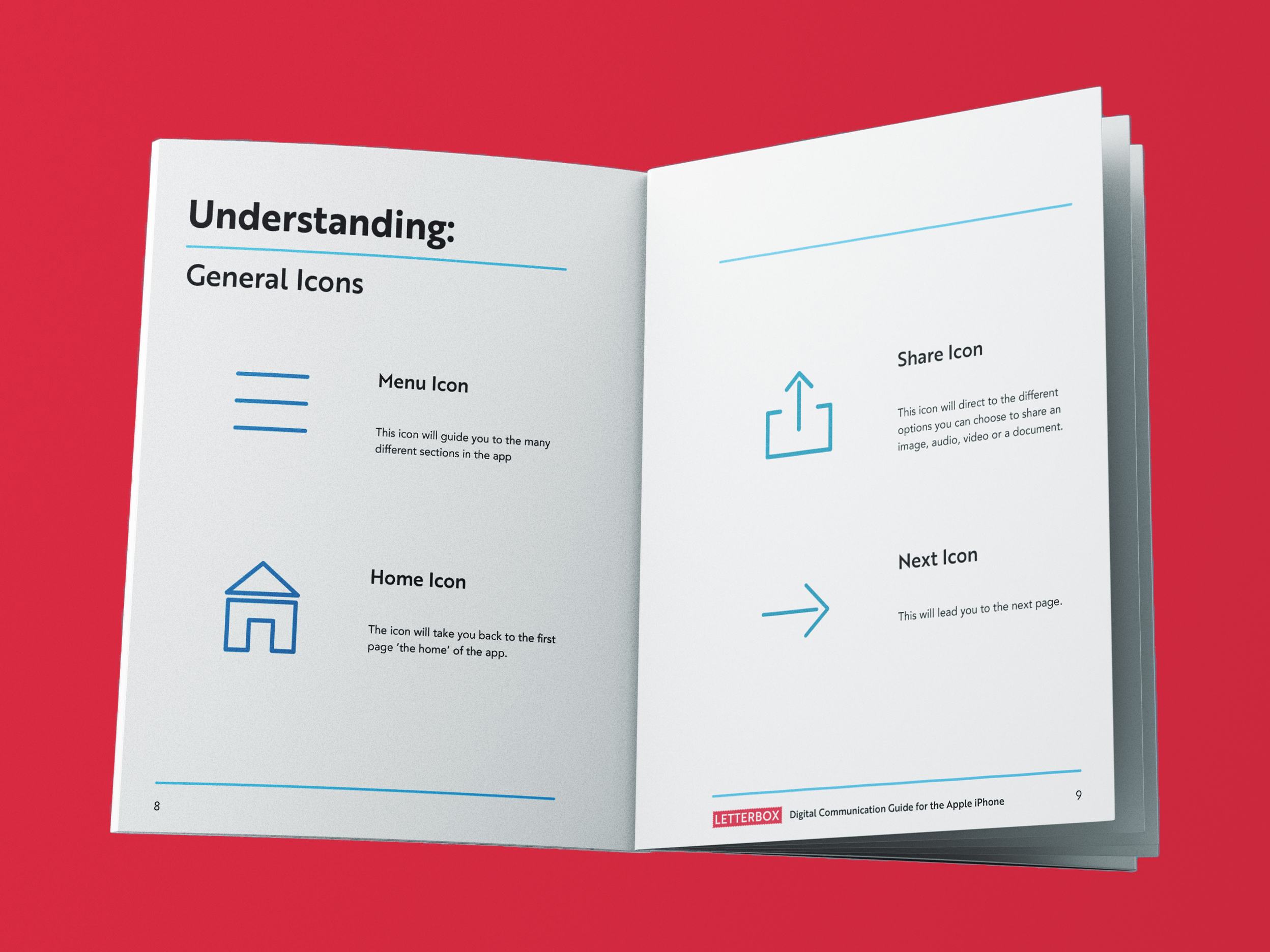
We created our own imagery in two instances; one for the postcard to help direct the reader to which device they have, the other was icons for the icon dictionary at the back of the booklet. The icon dictionary is there to help the elderly navigate many different interfaces. As we found through research that the icons we use are still very alien to our audience.
/ Logo

For the logo design we decided to make it so it looks like a stamp as a main part of our pack is that it goes through the post box. We chose to just have ‘LetterBox’ as our logo because we would create other packs that will come through the post and help the elderly.
///